ROImonks
15.07.2025
Unlock Better Data Analysis in GA4 with Plot Rows
Are you looking for a more efficient way to visualize and compare data directly within your Google Analytics 4 reports? A powerful feature you might be overlooking is Plot Rows.
This standard GA4 feature significantly improves how you can sort, segment, and interpret your data at a glance. It moves beyond simple tables and helps you instantly spot trends, compare audience segments, or identify correlations that might otherwise stay hidden.
If you’re not using it yet, it’s time to put this impactful feature in the spotlight.
Why You Should Be Using Plot Rows
Integrating Plot Rows into your analysis workflow makes the process more convenient and insightful. The key benefits include:
- Deeper Visualization: Instantly chart multiple dimensions against your primary metric on a single graph.
- Clearer Segmentation: Easily compare the performance of different segments, like traffic sources or device categories.
- Efficient Comparisons: See how different pages, campaigns, or regions stack up against each other over time.
- Faster Trend Identification: Quickly identify patterns, correlations, and performance discrepancies.
- Greater Data Granularity: Drill down into your data visually without needing to export it or build a separate report.
Key Things to Know About Plot Rows
Here’s a quick summary of how the feature works:
- It is available in all standard detailed reports under Acquisition, Engagement, and Monetization.
- You can select and visualize up to 5 dimension rows at a time.
- You have full control to include or exclude any dimension from the graph based on your analysis needs.
How to Use Plot Rows: A Quick Example
Ready to try it? Here’s how you can visualize your top pages in just a few clicks:
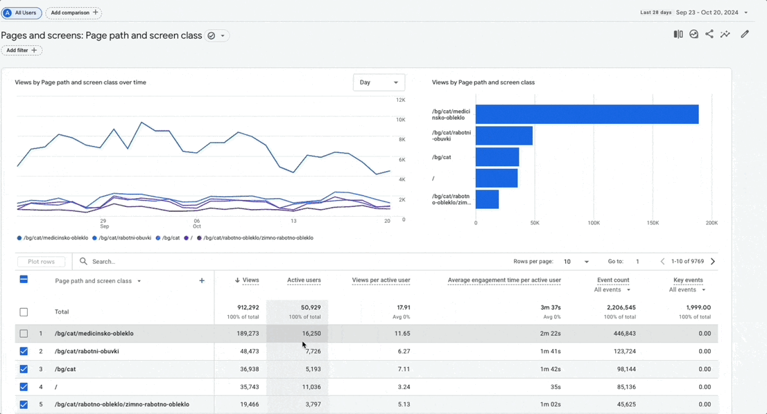
- Navigate to Engagement > Pages and screens.
- Scroll down to the detailed table below the main graph.
- Use the checkboxes on the left to select up to 5 rows (pages, in this case) that you want to compare.
- Click the “Plot rows” button that appears at the top left of the table.
Voila! The line chart above will refresh to display a separate, color-coded trendline for each of the pages you selected. You can now analyze and compare their performance more efficiently than ever.
If you’re looking for extra help with understanding data, check out our measurements and analytics service.
Want to hear from some of our top digital marketers or directly from our CEO?
GET A FREE CONSULTATION